Google Places is in constant change – what else is new! They continually test new ways to provide specific information about a place in the SERPs (search engine results pages). This past week all the buzz is Google Places new look. Blog posts from the experts on local search include Mike Blumenthal, Optilocal, Phil Rozek, and many others giving us a better understanding of what’s going on. After performing local searches in Chrome and Internet Explorer, here’s a snapshot of what I’ve been seeing:
A new look in the SERPs
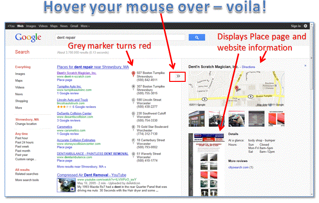
- The infamous red pins are now grey. If you hover your mouse over the grey pins they turn red.
- The map is vertically larger with more pin locations displayed – some little red dots.
- A new panel to the right displays with much more information when you click on the right arrow – Place page photos with more details and the website home page.
Prime marketing real estate
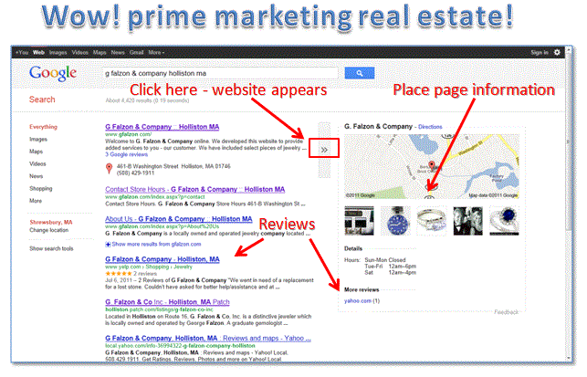
When you know the business your looking for here’s how the search results now appear. All I can say is “wow”, especially for the businesses that have claimed and optimized their Place page.
- All of the business information is above the fold – prime marketing real estate!
- Place page and website are displayed – click the right arrow and it will go between both.
- Citations (listings and directories) are listed.
Google still testing?
I believe Google is still testing because some of the changes keep changing. For example, yesterday I would click on the grey pin and it was taking me to the place of businesses website. Today, when I click on the pin, I go to either the website or the Place page. I’ve been testing my searches in Chrome and Internet Explorer with the same results.
Summing up
At first I thought “where are the red pins”! Well, I really love what Google has done. The search results display information without having to click on the Place page. For small businesses without much of a marketing budget and online presence this is huge since Google Places is free. They can establish their business online with little investment. Go and claim your Google Places listing! The more information added to the Place page the better. Upload the 10 photos and videos Google allows – they are “eye catching” and it’s proven people are more apt to click on a business with photos in search of more information.
Although the business description and categories do not show until you click on the Place page, these remain important factors as to how your business will rank. Be sure to optimize both so that your business will appear on the first page of the search results or better yet on the top of the first page search results.
Be sure to checkout the experts in local search. Their blogs are a wealth of information and they are always on top of what Google is up to:
Let us know what you think of the new look. I’m “happy as a clam” – are you as happy as I am?


