Last week Google+ launched a new version of Profile and Pages design. Jade Wang, Google+ Local Community Manger and Navin Kadaba from Google+ provided a Hangout that gives users a better understanding of the new updates to Google+. Navin’s main focus recently has been on the new design of the Google+ Profiles and Pages which impacts what Jade handles as the Google+ Local Community Manger.
Jade asked some excellent questions and Navin was right on top with the answers as he guides us through the new design. Below is a snapshot of what they went over in the Hangout. It is a “must watch” for those of you who use Google+, Google+ Business Pages and Google+ Local.
Help Desk Hangout Overview
Profile – New Design and Functionality
[ba-imagedivider style=”shadow”]Cover Photo: The new design is a major change which includes a larger photo. The profile photo appears in the lower left in a circular shape with your basic information next to it. When you scroll down to look at the posts the bottom part of the large photo locks in place. When you scroll back up, the whole photo appears. This give businesses the opportunity to be creative in what they use for a cover photo. Google+ has some photo templates you can use until you come up with something. For local businesses, I actually like the Map Photo – but that’s me.
Cover photo dimensions: The smallest size image you can use is 480×270 px – Google recommends that you upload an image that is 960 x 540 px. For HD displays, Google+ will take a maximum resolution of 2120 x 1192 px. Navin explains the dimensions in more detail and how to ensure your cover photo displays beautifully on any page.
Note: when you upload a photo, you have the ability to crop the photo to the right size. The new cover photo is for desktop only now – not mobile.
About page: The new design has a much cleaner look. You can see how your profile looks as you see it or as “the world” sees it by changing the “View Profile” to Public or to Yourself. Each section is editable on their own. For example, you can edit your story, where you work, where you went to school and more.
Reviews tab: Here you will see all of the places you have reviewed that are public. The page includes a map with markers that show the local businesses reviewed. If you want to edit or delete reviews, change your “View Profile” to Yourself to make the changes.
Profile settings: Your profile setting are where you setup who can see what. You can also decide what tabs you want to show. Profile setting default to showing all available tabs. If you don’t want one of them to show, uncheck the box. It’s a good idea to check your profile settings periodically as Google+ evolves.
Pages
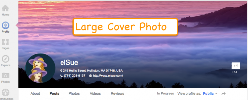
[ba-imagedivider style=”shadow”]The new Large photo design applies to Plus Pages too. Take a look at the elSue Business Page, it looks much like our Google+ Profile pages with the exception of the +1 Button. This is an easy way to tell if you are looking at a Profile or a Business Page.
When you stop by the elSue Business Page, if you are interested in keeping up with our blog, WordPress and Google+, please +1 and follow our Page.
Google+ Local
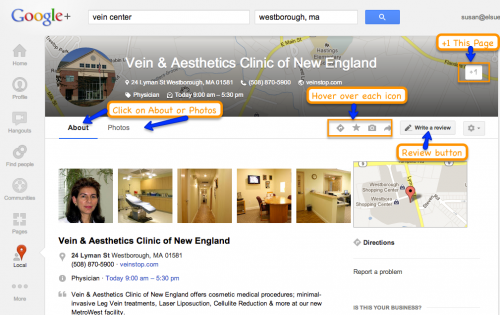
[ba-imagedivider style=”shadow”]The main change with a Google+ Local page is the Cover photo. If a business owner wants to change the cover photo, they would have to be an administrator on a Google+ page that has been merged with a Google+ Business page. For example, a store front business that has merged their Google+ Local page with a business page, has the ability to change the cover photo. Google+ Local pages that are not merged, are unable to change the new cover photo. We are looking into this more and will keep you updated.
Underneath the fold, everything remained basically the same except for the placement of action items (directions, star this place, upload photos, share this page). Here’s a labeled screen grab including the action items.
 Google+ Profile – YouTube Tab
[ba-imagedivider style=”shadow”]
This information is not included in the Hangout by Jade and Navin. I came across this post on TechCrunch. Google has made it easier to share your YouTube videos on your Google+ Profile with a YouTube Tab. On December 20, 2012 Don Carr from Google posted on his page YouTube and Google+, better together
[ba-quote]Many of you are avid YouTube users, so we wanted to make your sharing experience faster and easier. Starting today, when you upload a new public video to YouTube, you’ll have the option to share to Google+. Simply check the box, add a note, and you’re all set. [/ba-quote]On the same topic, did you know that you can choose your Google name as your identity on YouTube by linking your Google+ Profile with your YouTube channel. This helps access engagement and social features like Hangouts on Air. For more information click on YouTube and Your Google Identity.
If you unify your YouTube identity with Google+, it will be easier for your audience to find and connect with you on YouTube, Google, and across the web, and it will help you build your brand across all of Google’s products. Here’s more information if you wan to Adjust your Google identity appearance on YouTube.
Wrap-up
[ba-imagedivider style=”shadow”]On Jade & Navin’s Hangout be sure to checkout the Comments – I’ve always found them to be interesting and sometimes you will find some good “nuggets” of information not included a Hangout.
Google+ will continue to roll-out new features and enhancements to Profile and Business Pages. If you know of any new enhancements or have some tips as to how you or your business uses Google+, please leave a comment.


